







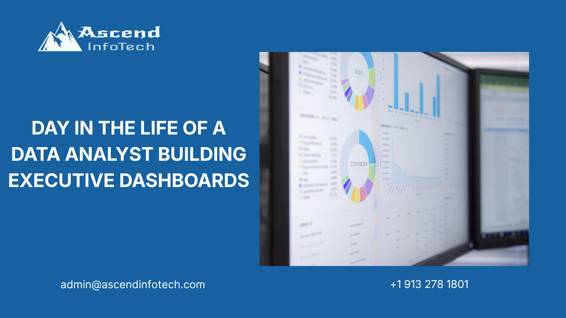
Day in the Life of a Data Analyst Building Executive Dashboards
At 8:10 AM, Maya opens three spreadsheets, two dashboards, and one very urgent email from a retail client. The data is messy, the budget meeting is at 3:00 PM, and the marketing team wants answers fast. This data analyst day in the life starts with cleaning broken files and ends with a boardroom discussion that changes where the client spends its money.
Maya works with retail and professional services teams that need clearer reporting, faster decisions, and a dashboard executives can trust. Her job is not just to pull numbers into charts. She has to clean the source data, decide what matters, and explain the story in plain language.
Morning Data Cleanup
Fixing the spreadsheet chaos
The first task of the day is not glamorous. Maya opens a workbook with 14 tabs, duplicate customer IDs, inconsistent campaign names, and missing revenue values. One sheet labels a campaign as “Spring Sale 2026,” another calls it “spring-sale,” and a third uses “SS26.” That kind of inconsistency can wreck a dashboard before it starts.
She spends the first hour standardizing date formats, removing duplicates, and reconciling campaign names across systems. The client’s data lives in marketing exports, CRM dumps, and finance files, so the same metric often shows up in different forms. Maya checks every field before loading anything into Power BI.
The cleanup matters because executives do not want to argue about whether the data is real. They want to know what it means. That is where data analytics and insights help businesses turn raw reporting into decisions leaders can act on.
Building a clean source table
After cleanup, Maya creates a master table with the fields the client actually needs for weekly review.
| Field | Problem Found | Fix Applied |
| Customer ID | Duplicate values | Deduplicated |
| Campaign Name | Multiple naming styles | Standardized |
| Revenue | Missing values | Reconciled with finance export |
| Region | Mixed abbreviations | Normalized |
| Date | Inconsistent formats | Converted to one format |
She keeps the table simple. The goal is not to store every possible detail. The goal is to make a reliable dataset that can support a dashboard executives will use without second-guessing it.
Dashboard Design
Turning data into a story
By 10:30 AM, Maya moves into Power BI. The retail client wants a dashboard that shows marketing performance, budget use, and channel return. She starts with three questions: what happened, where did it happen, and what should leadership do next?
The first dashboard version includes:
- Total campaign spend.
- Leads by channel.
- Cost per acquisition.
- Revenue by region.
- Conversion rate trends.
She builds each visual with a clear purpose. A line chart shows weekly trend movement. A bar chart compares channels. A heat map highlights regions where spend is high but conversion is low. The design is clean because executives do not have time for clutter.
Choosing the right visuals
Maya spends extra time matching the chart type to the question. A bad visual can hide a good insight. A good visual can change a budget conversation in minutes.
| Business Question | Best Visual | Why It Works |
| Which channel performs best? | Bar chart | Easy comparison |
| How did spend change over time? | Line chart | Shows trend clearly |
| Where are we overspending? | Heat map | Highlights problem areas |
| What is the budget split? | Donut chart | Useful for quick category view |
| How do revenue and spend relate? | Scatter plot | Shows correlation |
She keeps the dashboard focused on business outcomes. Every visual has to answer a decision the leadership team might actually make. That discipline keeps the dashboard from becoming a pretty report no one uses.
Executive Review Prep
Building the narrative
At noon, Maya prepares for the meeting with executives. The dashboard itself is ready, but the real work is the story behind it. She has to explain why one campaign is underperforming, why another region is overspending, and where the client should shift budget next quarter.
She drafts three talking points:
- Paid search is bringing traffic, but conversion is weak.
- Email is producing a lower volume of leads, but better quality.
- One regional campaign is costing too much for the revenue it generates.
Maya does not overload the room with technical terms. She translates numbers into business choices. That means she is not only presenting data, she is shaping the discussion around priorities and trade-offs.
The client’s finance team also wants a comparison between current spend and projected return. Maya adds a simple forecast view so leaders can see what happens if budget stays the same versus shifting money into better-performing channels.
Adding context for leaders
She knows executives do not want every chart explained from scratch. They want the answer, plus enough context to trust it. Maya adds callout boxes to show:
- what changed from last week,
- where performance is slipping,
- which metric matters most.
That extra layer helps the meeting move faster. It also gives marketing and finance a common language for the decision.
This is where business strategy supports executive decision-making from the numbers up.
The Client Meeting
Presenting to executives
At 3:00 PM, Maya opens her dashboard on the big screen. The CMO, CFO, and two department heads join the call. The room starts with a simple question: why is marketing spend rising while revenue is flat?
Maya walks them through the dashboard one section at a time. She shows that one paid campaign is consuming a large share of the budget but bringing low-quality leads. She also shows that email campaigns are producing fewer leads but a stronger conversion rate. The room gets quiet when the budget chart appears.
The CFO asks whether they should shift more money into email and reduce spend on paid search. Maya answers with data, not guesswork. She points to the trend line, the conversion numbers, and the regional performance view. Her recommendation is to reduce spend on the weakest paid campaign and reassign part of that budget to better-performing channels.
That recommendation changes the client’s marketing plan for the next quarter. It is a good example of why dashboard work matters. A clean view of the numbers can move a meeting from opinion to action.
Handling the tough questions
Executives always ask follow-up questions. Maya is ready for them. She explains where the numbers came from, how the spreadsheet issues were cleaned up, and what assumptions were used in the forecast. Because she documented the process earlier in the day, she can answer quickly and confidently.
The client also asks whether the dashboard can be refreshed daily instead of weekly. Maya says yes, but only if the source files stop arriving in inconsistent formats. She offers a practical fix: a shared template for future campaign exports and a small data quality checklist for the marketing team.
That kind of answer builds trust. It shows that the dashboard is not just a report; it is part of a working process.
The reporting stack becomes easier to manage when the team has the right foundation, and that is where cloud apps can help teams manage data flow and reporting access more efficiently.
What The Role Needs
Skills that matter
A strong data analyst needs more than spreadsheet skill. The role depends on judgment, communication, and the ability to keep messy data from turning into messy decisions.
| Skill | Why It Matters |
| SQL | Pulls and joins data correctly |
| Excel | Cleans and checks source files |
| Power BI / Tableau | Builds dashboards leaders can use |
| Data storytelling | Turns charts into decisions |
| Stakeholder communication | Helps non-technical teams understand the results |
| Attention to detail | Prevents errors from slipping into reports |
Maya uses all of these in one day. She works with retail and professional services clients that need clear reporting, fast insight, and a dashboard that supports budget decisions. That mix of technical work and business communication is what makes the role valuable.
Closing
By the end of the day, Maya has cleaned broken spreadsheets, built a dashboard, and helped the client rethink marketing spend. That is the real value of the role: turning scattered numbers into clear decisions.
For retail and professional services clients, this kind of work keeps teams aligned and budgets focused. For the analyst, it is a day of detail, pressure, and useful impact.
FAQ
What does a data analyst do in a day?
A data analyst cleans data, builds dashboards, checks metrics, and presents findings to business teams. The work often includes spreadsheet cleanup, chart building, and stakeholder meetings.
Why is the data analyst day in the life useful content?
It shows how analysis connects daily tasks with real business decisions. Readers can see how messy data becomes a dashboard and how that dashboard shapes budget choices.
What tools do data analysts use?
Common tools include Excel, SQL, Power BI, Tableau, and reporting platforms tied to CRM or marketing systems. Some analysts also use Python for deeper analysis.
How do dashboards help executives?
Dashboards give leaders a quick view of performance, trends, and risks. They help teams decide where to spend, what to fix, and what to review next.
What makes a good dashboard?
A good dashboard is clean, focused, and tied to business questions. It should show only the metrics that help people make a decision.
Do analysts need presentation skills?
Yes. A large part of the role is explaining findings to people who do not work with data every day. Clear communication is just as important as technical skill.