


10 Data Visualization Techniques That Tell Better Stories
In the data-driven world of today, companies produce enormous volumes of data every day. To make sense of this data and communicate insights effectively, organizations rely on data visualization techniques. These methods transform raw data into visual formats such as charts, graphs, and maps, allowing decision-makers to identify trends, correlations, and outliers quickly.
Effective data visualization is not just about presenting numbers—it’s about creating a story that makes complex information accessible and actionable. As we move into 2025 and beyond, the demand for storytelling with data continues to grow. Modern analytics tools are evolving to support richer, more interactive, and more intuitive visual experiences that empower everyone, not just analysts, to understand data insights clearly.
Let’s explore 10 powerful data visualization techniques that can help you tell clearer, more compelling stories and drive smarter decisions.
What Are Data Visualization Techniques?
Data visualization techniques refer to the various methods used to represent data visually. These techniques include bar charts, line graphs, heatmaps, scatter plots, and many more. Each visualization type serves a specific purpose and helps communicate data in a way that is both understandable and impactful.
For instance, a line graph helps display trends over time, while a pie chart is best for showing proportions. Similarly, a heatmap highlights areas of intensity or activity. The choice of visualization technique depends on the type of data you’re working with and the story you want to tell.
In essence, data visualization techniques bridge the gap between analytics and storytelling. They turn large, abstract datasets into visual narratives that engage audiences and inspire informed actions.
Types of Data Visualization Techniques
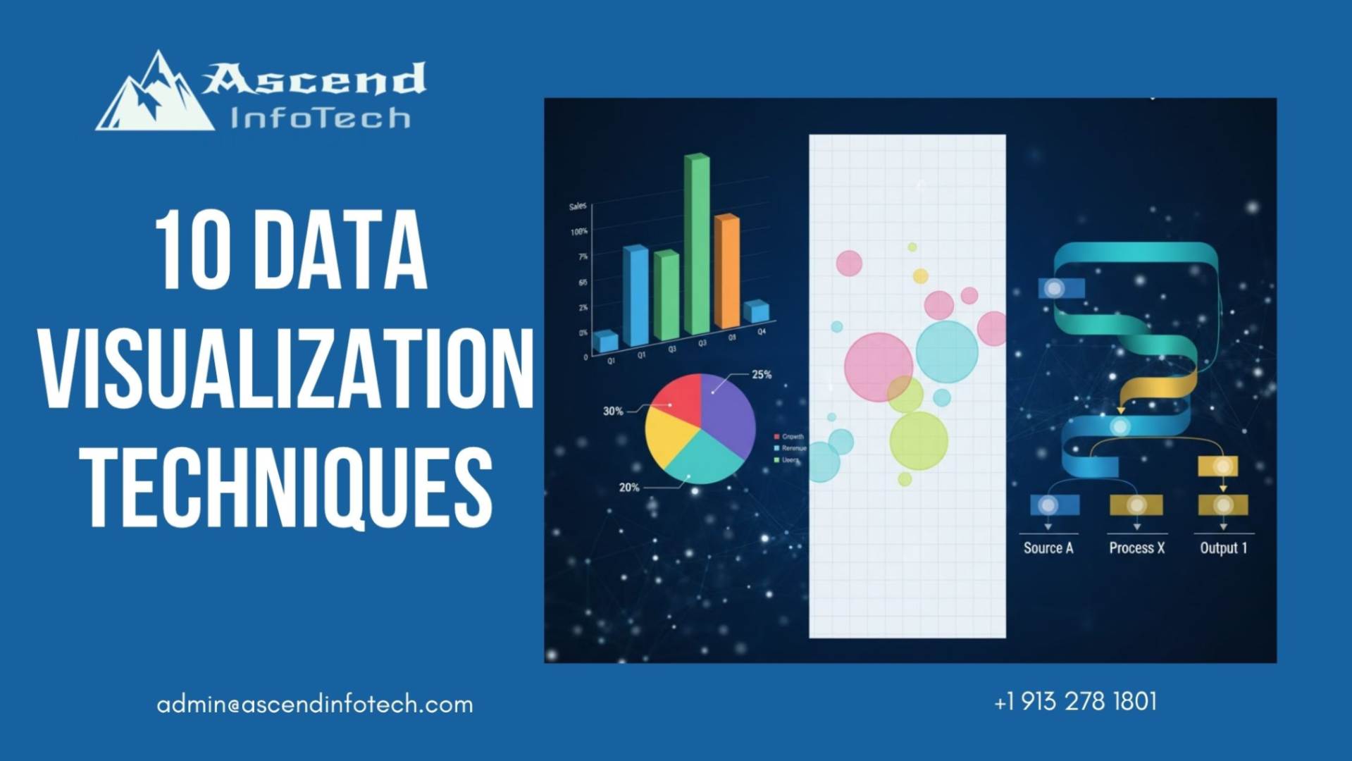
When selecting the right visual format, it’s essential to understand the variety of techniques available and the situations where each is most effective. Below are ten key types of data visualization techniques that are widely used in analytics and business intelligence.
1. Bar Charts
Bar charts are one of the most common and straightforward visualization types. They are ideal for comparing different categories or groups. A bar chart can be used, for instance, to compare quarterly sales by area. Ensure that the bars are of uniform width and use contrasting colors for easy differentiation.
2. Line Graphs
Line graphs are perfect for visualizing trends and changes over time. They are particularly useful for displaying data such as website traffic, revenue growth, or temperature variations. To maintain clarity, avoid using too many lines in one chart, as it can make interpretation difficult.
3. Pie Charts
Pie charts show the proportion of parts that make up a whole. They are most effective when you have fewer than five categories. For example, a company might use a pie chart to show the percentage contribution of each product line to total revenue. Keep the design simple and avoid unnecessary labels.
4. Heatmaps
Heatmaps use color gradients to represent data values, making it easy to spot high and low concentrations. They are particularly useful for visualizing large datasets or identifying patterns, such as customer engagement levels across regions. Choosing the right color palette is crucial to avoid misinterpretation.
5. Scatter Plots
Scatter plots display the relationship between two variables and help identify correlations. For instance, a scatter plot could show the connection between marketing spend and sales performance. Adding trendlines can help emphasize the relationship visually.
6. Tree Maps
Tree maps display hierarchical data through nested rectangles, where the size of each rectangle represents a specific value. They are particularly effective for showing proportional relationships within categories, such as budget allocations across departments.
7. Bubble Charts
Bubble charts take scatter plots a step further by introducing a third variable represented by the bubble’s size. This makes them great for showing multi-dimensional data. For example, you can visualize countries based on GDP, population, and economic growth rate simultaneously.
8. Sankey Diagrams
Sankey diagrams show the flow of data between different stages or entities. They are excellent for visualizing energy usage, financial transactions, or user journey flows. The width of the flow lines represents the magnitude of the data, making them intuitive and engaging.
9. Word Clouds
Word clouds are used to visualize text data by displaying words in varying sizes based on frequency or importance. They are ideal for summarizing customer feedback, social media mentions, or survey responses. However, they should be used as a high-level overview rather than for detailed analysis.
10. Infographics
Infographics combine multiple charts, icons, and text to create a cohesive visual narrative. They are highly effective for storytelling, as they guide the viewer through key data points while maintaining engagement. Infographics are often used in reports, presentations, and marketing content.
How to Choose the Right Data Visualization?
Selecting the right data visualization technique depends on several factors, including the type of data, the goal of your analysis, and your audience. Here are some essential guidelines:
- Define your objective: Clarify whether you want to show trends, comparisons, relationships, or distributions.
- Know your data type: Numerical, categorical, and temporal data each require different visualization techniques.
- Consider your audience: Tailor your visuals to match your audience’s data literacy and interests.
- Keep it simple: Keep things simple and concentrate on clarity.. Every visual element should serve a purpose.
- Maintain consistency: Use consistent colors, scales, and fonts across all visualizations to ensure readability.
A quick reference:
- Use column charts or bar charts to compare values.
- To show trends over time, use line graphs.
- To display parts of a whole, use pie charts or tree maps.
- To highlight relationships, use scatter plots or bubble charts.
- To analyze flow or hierarchy, use Sankey diagrams or tree maps.
By following these principles, you can ensure your visualizations effectively communicate your story and insights.
Tools to Create Stunning Data Visualizations
There are numerous tools available today that make it easier than ever to create interactive and insightful visualizations. Here are some of the most popular and powerful options:
- Tableau: To create data into visuals tableau is a leading platform known for its ability to handle large datasets and produce interactive dashboards.
- Power BI: Microsoft’s business analytics tool that integrates seamlessly with other Office products.
- Google Looker Studio (formerly Data Studio): A free tool ideal for creating shareable reports and dashboards.
- Qlik Sense: Known for its associative data model and AI-driven insights.
- D3.js: A JavaScript library for developers who want full control over their visualizations.
- Excel and Google Sheets: Perfect for quick, simple visualizations when working with smaller datasets.
Choosing the right tool depends on your data size, visualization needs, and technical expertise. Most modern tools also offer templates, drag-and-drop features, and integrations with various data sources, making the process accessible for both beginners and experts.
Conclusion
In the modern data landscape, the ability to visualize and communicate insights effectively is a vital skill. Data visualization techniques transform numbers into narratives that drive understanding and action. By choosing the right technique—whether it’s a bar chart for comparisons, a scatter plot for correlations, or a Sankey diagram for flow—you can turn complex datasets into stories that resonate.
At Ascend InfoTech, we believe that every data point has a story to tell. Our goal is to help businesses uncover insights that fuel smarter decisions and meaningful growth. If you’re ready to elevate your data storytelling and make your analytics more impactful, get in touch with Ascend InfoTech today to learn how we can help you turn your data into actionable insights.
FAQs
Data visualization techniques are used to present complex datasets in visual formats such as charts and graphs. They help people understand patterns, trends, and relationships within data easily.
Line graphs are the most effective for trend analysis as they show how data points change over time, helping users identify patterns and fluctuations quickly.
Start by defining your goal—whether you want to compare, show trends, or analyze relationships. Then match your data type and objective to the appropriate chart or visual format.
A heatmap uses colors to show data intensity or frequency across a matrix, while a scatter plot displays the relationship between two variables using dots on a coordinate plane.
Yes. Tools like Google Looker Studio, Power BI, and Tableau offer user-friendly interfaces that allow even beginners to create professional-quality visualizations without coding knowledge.